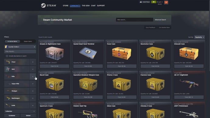
Valve continues its ongoing Steam UI overhaul by targeting the Community Market next. The redesign prioritizes width, expanding the layout to utilize more screen space on modern monitors. This aligns with Valve's broader pattern of enlarging interface elements across Steam's ecosystem over the past year.
The Community Market handles millions of player-to-player transactions daily, from cosmetics in Counter-Strike 2 to trading cards across hundreds of titles. Widening its interface aims to display more listings simultaneously and reduce scrolling friction. Players browsing high-volume markets like Dota 2 or Team Fortress 2 will notice immediate changes in how items populate the page.
Valve's UI philosophy has shifted noticeably. Previous updates expanded the Steam Store homepage with wider product tiles and infinite scrolling. The Workshop received similar treatment to showcase community mods more prominently. The Community Market update follows this trajectory, suggesting Valve recognizes that modern 1440p and 4K displays demand interface scaling that older designs never accommodated.
This matters for market health. Better visibility reduces search time and encourages browsing. Players encountering more options faster may spend more on cosmetics and trading cards. Sellers benefit from increased discoverability. The ripple effect touches game economies reliant on Steam's transaction infrastructure.
Whether these changes improve actual user experience depends on execution. Wider layouts risk overwhelming players on smaller screens or forcing awkward scrolling on ultra-ultrawide monitors. Valve typically iterates based on beta feedback before full release, so the real test comes through player adoption.
The Community Market redesign arrives as a beta feature, allowing Valve to gather data before pushing it live. This methodical approach has become standard for their UI team, contrasting sharply with their historically hands-off attitude toward client improvements. Steam's evolution accelerates.